|
|
You are here: Foswiki>Development Web>BrainStorming>RethinkingTopicInteraction (12 Mar 2014, MichaelDaum)Edit Attach
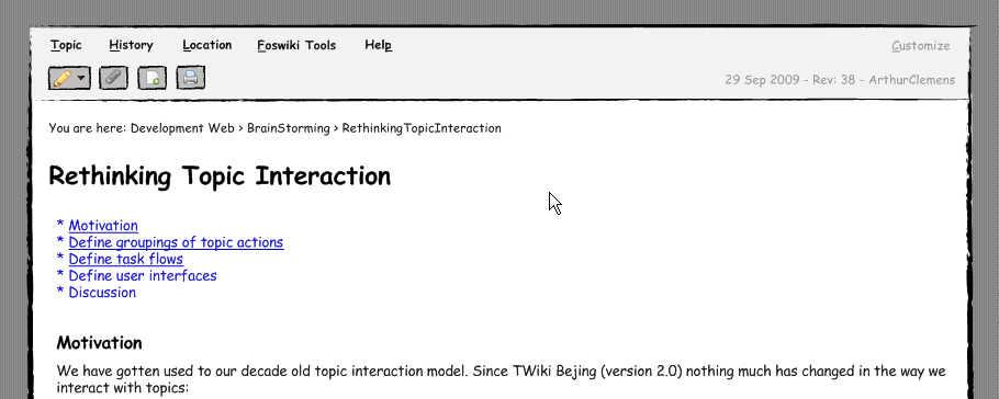
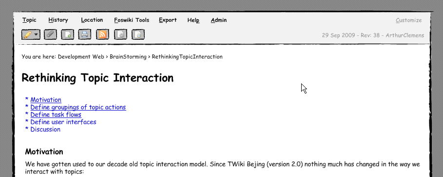
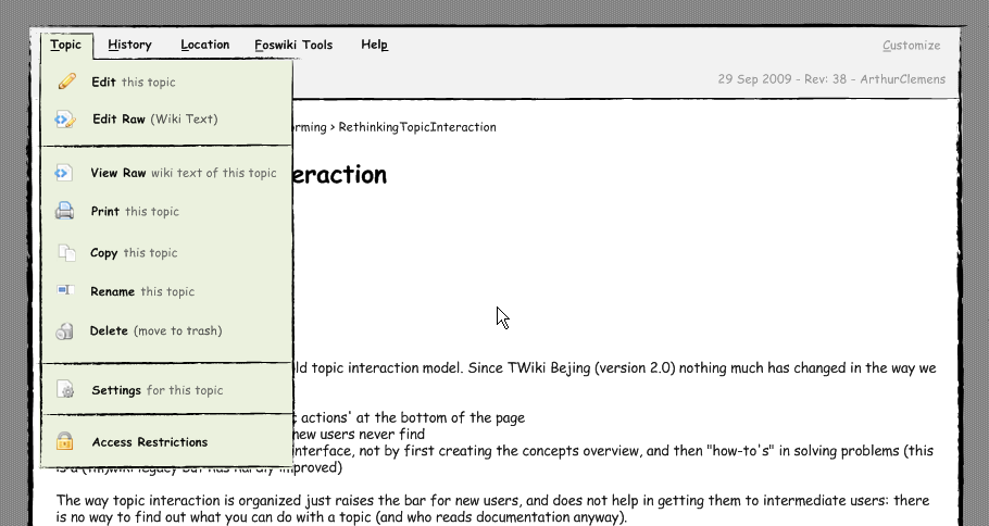
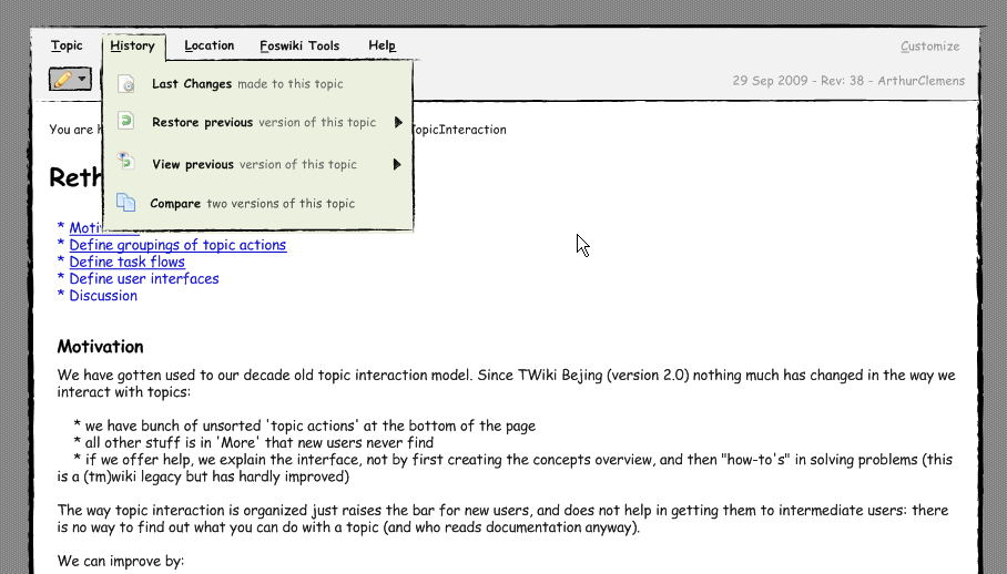
Rethinking topic interaction
No matter how cool your interface is, less of it would be better.
Motivation
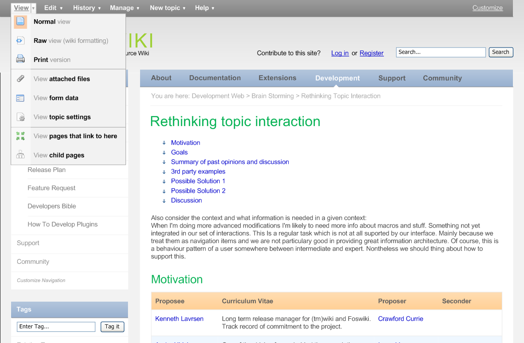
We have gotten used to our decade old topic interaction model. Since TWiki Bejing (version 2.0) nothing much has changed in the way we interact with topics:- we have bunch of unsorted 'topic actions' at the bottom of the page
- all other stuff is in 'More' that new users never find
- if we offer help, we explain the interface, not by first creating the concepts overview, and then "how-to's" in solving problems (this is a (tm)wiki legacy but has hardly improved)
- grouping actions
- get rid of the More screen
- provide help with each group (focus on how to solve a problem, not explaining the interface)
- Define the most logical groupings of topic actions
- Define task flows and how these can be supported best
- Define the user interfaces for these task flows
Goals
- Do not overwhelm beginners with too many default options
- Allow beginners to become intermediates more easily - give them clues, direct them towards the power foswiki has to offer
- Allow intermediates and experts to customize the interactions according to their needs
click to enlarge
Summary of past opinions and discussion
see rev=38 for all the comments thus far. Summary of stated opinions:- focus on the most essential actions
- - I think these are the essential actions for default use: Edit, Attach, History, Manage, New topic. But of course it should be made easy to change that setting, either by expanding or by limiting it. (AC)
- Make buttons context sensitive so that if a user is not entitled to perform an action, it just doesn't show up in the menu (grayed out?)
- Make it easy to configure the links
- For instance to remove all edit buttons, for admins configure a menu that only shows admin accessible actions - move web, rename web, log out.
- Plugins should have a simple way to add to or replace items in the menus
- The PDF plugins could add a view PDF action. PDFLatex, a Latex button.
- How do extended operations fit into this overall scheme, for instance "Subscribe"?
- Daily links should be directly accessible
- Combine quick links and dropdown menus
- Menu labels should preferably be verbs
- Some groupings are not that logical: do we expect Print under View? Same goes for History, Link, reparenting.
- Some of the actions might fit better into the "Edit" workflow itself, so a separate menu item is not necessary
- While a menu structure might be well thought out to cover all actions, the top level does not make up a good toolbar.
- We should optimize the interface towards the intermediate users. Repeated actions need to be fast and efficient.
- Some clients/users prefer a UI which is limited to absolute minimum, eg. "Edit, Attach, New"
- No-click:
- seeing the topic revision, date, author
- breadcrumb
- 1-Click:
- diff between this and previous version
- Edit Raw
- View Raw
- Edit Wysiwyg
- compare rev's
- 2-click *...
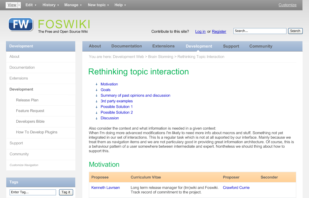
When I'm doing more advanced modifications I'm likely to need more info about macros and stuff. Something not yet integrated in our set of interactions. This Is a regular task which is not at all suported by our interface. Mainly because we treat them as navigation items and we are not particulary good in providing great information architecture. Of course, this is a behaviour pattern of a user somewhere between intermediate and expert. Nontheless we should think about how to support this.
3rd party examples
An application that has the same intention, namely grouping related actions on the screen: the application menu of Adobe Acrobat (not the textual menu at the top of the screen):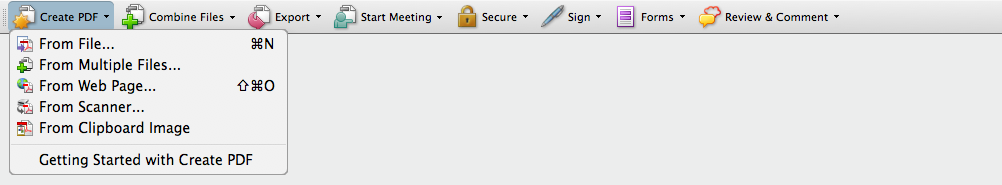
click to enlarge
click to enlarge
Possible Solution 1
I have taken a shot at designing the interaction. The menu is really simple now, but that is also the result of removing Print (should be elsewhere on the page), Backlinks (ideas?) and the < < < history links. Also I found the label History to cover the contents well, and making a verb from it would stretch it ("Compare versions" for instance). "New topic" instead of "Create new topic" also works fine.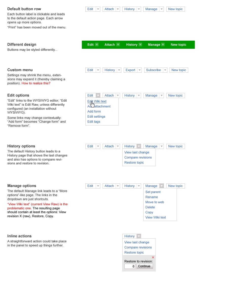
click to enlarge
Possible Solution 2
I have taken a slightly different path... Some thoughts:- We promote Foswiki as a tool to build or integrate applications including build-in wiki functionalities (which is not the main focus of development anymore).
- When we look at how we interact with foswiki it becomes obvious that our needs as a user pretty much depend on the context of the topic we are looking at.
- A discussion topic, a template topic, a topic which powers a wiki application - they all require different interactions and more important, they require knowledge about all the things Foswiki has to offer.
- Infos about Macros, plugins, help resources, etc. they are all more or less hidden behind a rather crappy information architecture - but to become an intermediate or expert user I need to know and be able to find them in the context of my interactions.
- Desktop applications feature such an interface in the form of menus and toolbars...
- What about styling the interactions in such an application orineted way? This would greatly allow us to show that there's more than just "edit" without creating a too complex UI for our beginners...
- revision info and breadcrumbs visible
- a basic set of one-click interactions
- a standard set of menus introducing the remaining interactions
- a customize link in the top right would lead to a screen which lets you customize your menus and buttons
click to enlarge
Possible extended view:
- Menu and buttons expanded
- eg. with an export menu which only shows up when export functionalities are enabled via plugins.
- additional buttons are just examples... - we will need mouse-over explanations of course
- odering would be handled via to be designed "customize" screen
- When logged in as admin user (or when user is part of Admin Group) an additional admin menu shows up.
click to enlarge
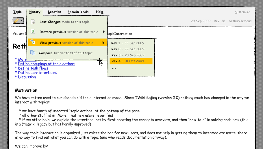
"Topic" menu
click to enlarge
"History" menu
- second sketch shows examples of a possible sub-menu integration
click to enlarge
click to enlarge
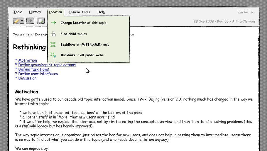
"Location" menu
- "Change location" would be a unification of re-parent and move. Although different from a technical perspective they are really really similar from a non-techie perspective.
click to enlarge
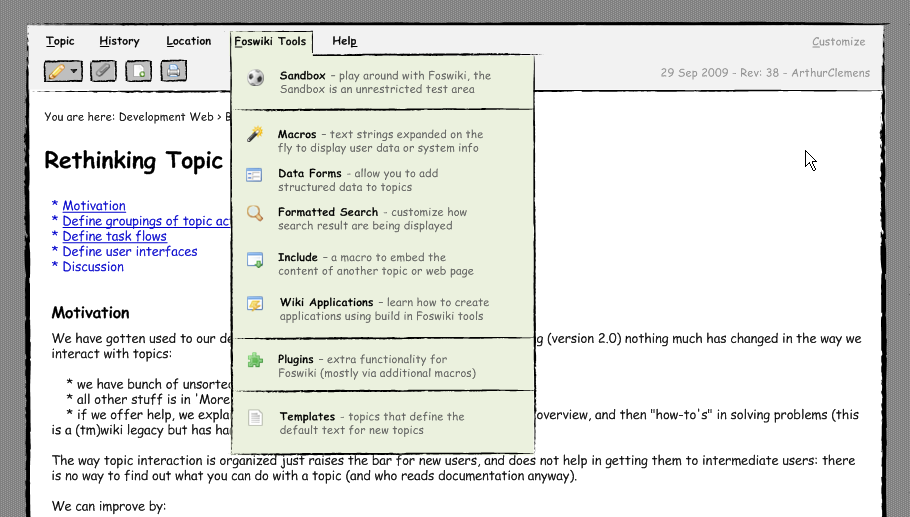
"Foswiki Tools" menu
- The idea is to feature the most important foswiki tools in this menu to allow learners quick and context fitting access to our daily toolset.
- This menu behave differently than the others as all items in this menu are links.
- question 1: is this much of a problem after learning it in the first place?
- question 2: how to solve this? New window / tab? Modal overlay?
click to enlarge
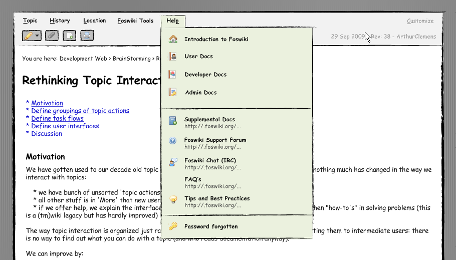
"Help" menu
- I very well remeber how much I struggled to even find out about the support forum or IRC and other resources...
- Why not offer this as part of the interaction menu?
click to enlarge
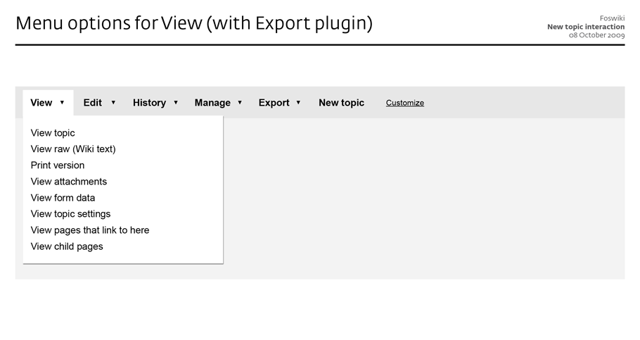
"Export" menu
- a menu which would only show up once "exporting" plugins have been enabled:
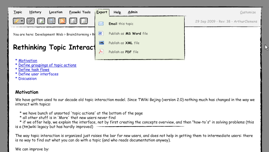
click to enlarge
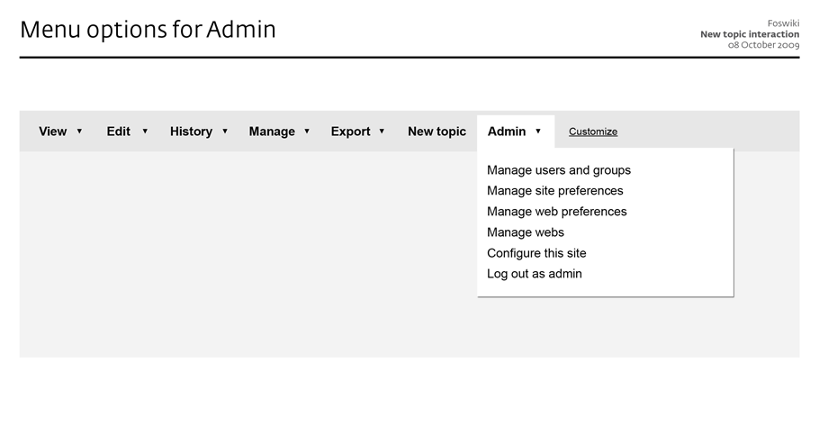
"Admin" menu
- Shows up only when logged in as admin or when user is part of admin group
- gives access to prefs, configure, security topics...
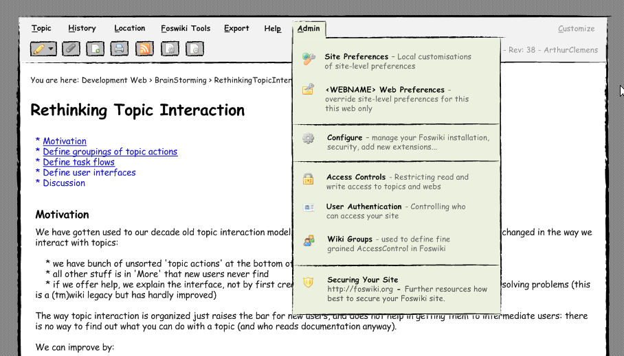
click to enlarge
Bottom line: Menus and their content may need fine tuning and the ones among us that lived in fossy-land for too long may need to get over the fact that the interface and wording do not reflect the implementation model 1:1 anymore. However, I think this interface would far better...
- demonstrate the underlying power of Foswiki without disturbing beginners.
- follow existing interaction patterns and thus providing a already familiar apperance
- allow admins/experts to extend the interaction menu without breaking everything visually
Discussion
see rev=38 for all the comments before 5th Oct 2009. -- CarloSchulz - 05 Oct 2009 I like it: users easily recognize a more application-like interface. One first thought: how does the topic interaction part itself "interact" with the rest of the site, that comes with its own navigation, like sidebars and horiz menus? If you continue to add the rest of a normal webpage around, it might create confusion which parts implement interaction with the site and which part enable interaction with the current topic. Just try adding a horiz site menu. -- MichaelDaum - 05 Oct 2009 I have a version with those sorrounding elements like nav and sidebar already. I just need to play with them a bit more to find out what fits best. Just thought it would be better to discuss the general idea first. Besides your valid points, there is a whole lot more we need to address. The edit screen and others needs to fit into that concept as well. So you are right, no interface part should be treated as single entity -- CarloSchulz - 05 Oct 2009 Some wikis design topic interaction at the very top of the html viewport. So it looks more like a part of the browser than part of the web application. This would distinguish it from site navi at least... -- MichaelDaum - 05 Oct 2009 Carlo, great you are extending and improving upon my line of thought. Nice style BTW, the hand drawn look. A couple of remarks:- A lot of wiki content is meant for viewing. When viewing, the app interface is in the way - it takes up a lot of space and just looks complicated. Having it at the bottom (when viewing) moves it out of the way.
- An app menu - by its nature - is expected to be consistent, unchanging. So I am not sure how that we can extend this to other screens.
- Having this application menu does not solve the need to have inpage buttons (like "Save" and "Cancel") on other screens.
- The application menu also cannot completely do away with inpage structures. For example, for a long time I want to change the interface of the attach screen to have tabs "Upload", "Delete" and so on. The app menu command may be too much hidden for a web page.
- Or perhaps the app menu design has to be taken further towards webpage land, with larger buttons and elements like tabs.
- Google has a lot of web apps that do not look like desktop apps at all.
- I am not convinced that we need to split menu items and one-click buttons. I think a lot of web 2.0 interfaces show these can be combined in multi-buttons (as sketched above).
- I also find the icons problematic (but it may be we have too many of them on the site).
- But icons work in the fold out panes, where they enhance the menu labels.
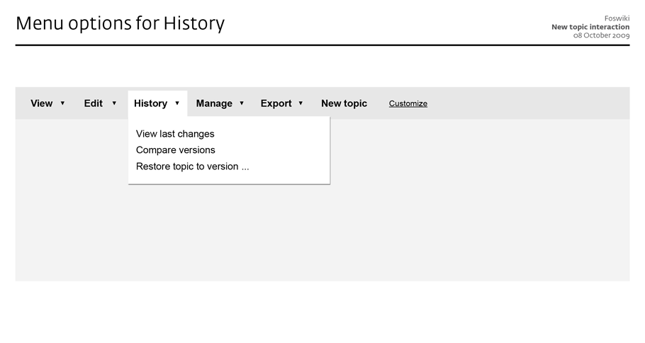
- View previous version: that can be just one item: the previous one. All other revisions belong to History view and just may not be available as shortcut.
- Foswiki Tools feels too generic (not a solution to an information need).
- Of course we do need to link to macros, but mainly when editing.
- If you want to add an attachment to a topic (and you often find out while editing), you:
- In edit mode, save the topic
- Go to attach, and upload a file
- In view mode, click on edit
- Put the attachment someplace
- To correct a mistake or vandalism, you:
- Check in raw view what the problem is
- Check previous revisions, until you find one where the topic is still ok
- Go to More, restore revision
- Verify the restored revision in edit mode, and save
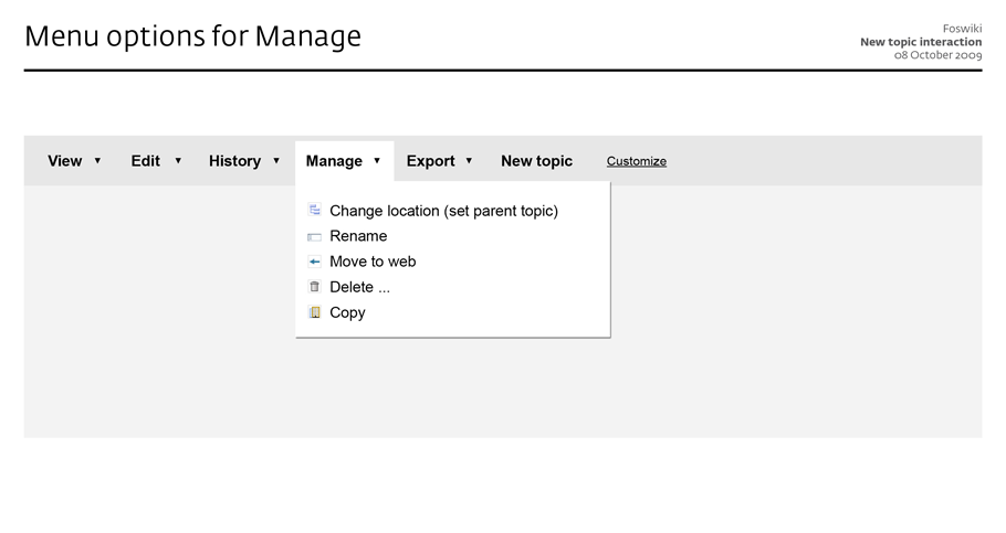
- Setting the location (parenting) of multiple topics is a pain, because you have to go from view to More to view again for each topic
- Screens are set up in an inconsistent way, so you have to look for your action links (especially for those hidden on the More screen)
- The action buttons on the view screen are displayed such that they do not hinder reading the page. But it means that they are inconveniently placed when in a workflow. Looking for links breaks the workflow.
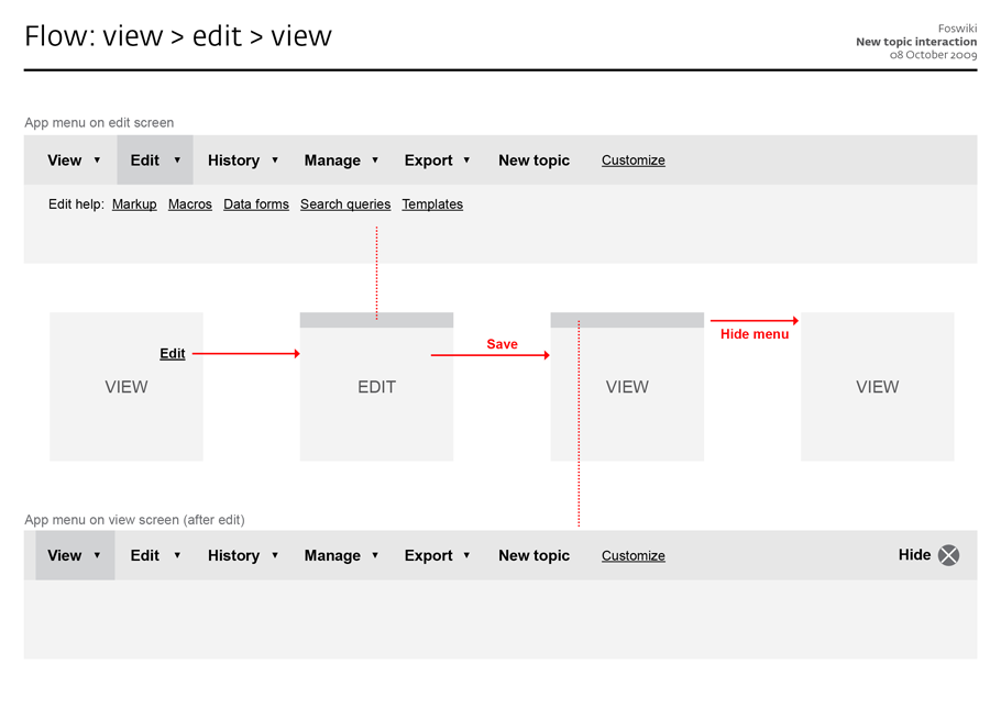
- Have a constant app menu across all screens
- Provide folding out menus with additional commands
- Only provide commands, no content links in the menu
- Only show the app menu when having performed an action, so it is not visible on the view screen at first
- Provide the option to hide the app menu again from the view screen
- Print and RSS are not part of the app menu, instead should be offered near the content
click to enlarge
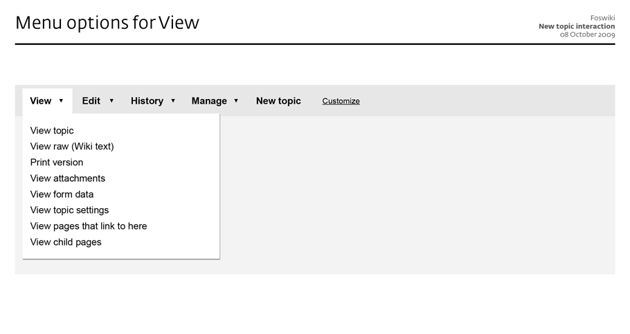
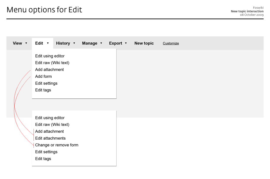
- I have added the View menu
- I have copied Carlo's idea of having icons in the fold out menus-- JtHolmes - 25 Dec 2009
- To reduce the number of menu items, I have folded Attach under Edit
click to enlarge
click to enlarge
click to enlarge
click to enlarge
click to enlarge
- new web
- rename web
- delete web
-
configurefoswiki - WebPreferences
- SitePreferences
click to enlarge
- You need to take into account the frequency of use. How many times will a user (not admin) do something with web settings/publish/rename a web, let alone a site? I am afraid you end up with 2 unused buttons, and one "topic" button that does not reveal the meaning. In a way it is categorized hierarchically correct, but not optimized for use. -- ArthurClemens - 09 Oct 2009
- Carlo's menu is a mix of actions (Topic, History) and pointers to HOWTOs, and is designed to provide in a nutshell all capabilities of and help for working with Foswiki.
- Arthur's menu is a mix of direct actions (Edit) and links to action landing pages (History) - where the folded out links are all pointers to action screens. It is designed to facilitate workflows.
- Carlo's menu offers Tools and Help, which could well be combined into Help. We could have 2 columns in the fold out pane to create groupings.
- Arthur's menu offers no help, but should.
- Make it easy to jump from one action screen to the other, without having to search for it
- Make it easy to change the menu based on rights / group membership / personal preference / ...
- This could evolve to have a menu based on a chained action workflow (f.i. Create writing task, Review submissions, Combine to one paper, Publish)
- Give guidance, for example by showing the current step
- Carlo's menu offers Topic, and additionally History, Location and Export, which all three are topic actions, and could just as rightly be offered under Topic. This distinction is a bit confusing.
- When on the Edit page, the menu would still show "Topic" as first item, which is less helpful
- A place must be found for Attach and Topic form
- Carlo's menu separates groups of actions (most used, less used, and conceptual groupings) which eases scanning tasks
- Carlo's menu has bolded and blackened action words which eases scanning tasks as well
- Carlo's menu offers help descriptions, especially useful for the Help links
- Arthur's menu has laid open the main topic actions View, Edit, History, Manage, New topic - which make them one-click targets to continue the task at hand, and by highlighting the current (main) task screen functions as location indicator


 -- MartinSeibert - 11 Oct 2009
Here are some unordered remarks.
"Edit" and "Change" as label for these two menus are very close semantically.
Some of the "Edit/Change" actions are probably already reachable as part of the edit screen. The current menu as far as I understand is a menu for the view screen. There might be some actions that could be deferred to the edit screen. Candidates are: Add/remove form, Settings, Repartent, Attachments, Tagging, Rename/Change title. All of these are arguable of course. The point is that I have the feeling that there are too many things to "Edit" or "Change".
"New topic" is an area that needs to be customizable. For instance, if you deployed a blog, bug tracker, time tracker, project management app in the current web, users want to create a new topic of a very specific kind, e.g. "New discussion", "New bugreport", "New ...". This highly interferes with the templates each of these topic types need....
-- MichaelDaum - 11 Oct 20
The current menu as far as I understand is a menu for the view screen - no, this is the menu for all screens, except when on the screen itself, the menu item is highlighted. The links in the fold out menu are shortcuts to specific screens, for instance a Settings screen, or a edit tags screen (if a tag plugin is installed).
-- ArthurClemens - 11 Oct 2009
The next step should be a prototype, to give a feeling of the interaction of the menu with topic states.
-- ArthurClemens - 25 Oct 2009
on the prototype: I'm almost done I just need to update it to thel latest version (11 Oct. 2009)
-- CarloSchulz - 26 Oct 2009
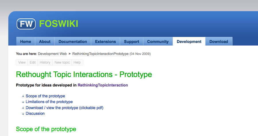
a limited prototype is now available on RethinkingTopicInteractionPrototype
-- CarloSchulz - 03 Nov 2009
The Wikipedia makeover (currently in beta) has some similarities (but is also very different):
-- MartinSeibert - 11 Oct 2009
Here are some unordered remarks.
"Edit" and "Change" as label for these two menus are very close semantically.
Some of the "Edit/Change" actions are probably already reachable as part of the edit screen. The current menu as far as I understand is a menu for the view screen. There might be some actions that could be deferred to the edit screen. Candidates are: Add/remove form, Settings, Repartent, Attachments, Tagging, Rename/Change title. All of these are arguable of course. The point is that I have the feeling that there are too many things to "Edit" or "Change".
"New topic" is an area that needs to be customizable. For instance, if you deployed a blog, bug tracker, time tracker, project management app in the current web, users want to create a new topic of a very specific kind, e.g. "New discussion", "New bugreport", "New ...". This highly interferes with the templates each of these topic types need....
-- MichaelDaum - 11 Oct 20
The current menu as far as I understand is a menu for the view screen - no, this is the menu for all screens, except when on the screen itself, the menu item is highlighted. The links in the fold out menu are shortcuts to specific screens, for instance a Settings screen, or a edit tags screen (if a tag plugin is installed).
-- ArthurClemens - 11 Oct 2009
The next step should be a prototype, to give a feeling of the interaction of the menu with topic states.
-- ArthurClemens - 25 Oct 2009
on the prototype: I'm almost done I just need to update it to thel latest version (11 Oct. 2009)
-- CarloSchulz - 26 Oct 2009
a limited prototype is now available on RethinkingTopicInteractionPrototype
-- CarloSchulz - 03 Nov 2009
The Wikipedia makeover (currently in beta) has some similarities (but is also very different):
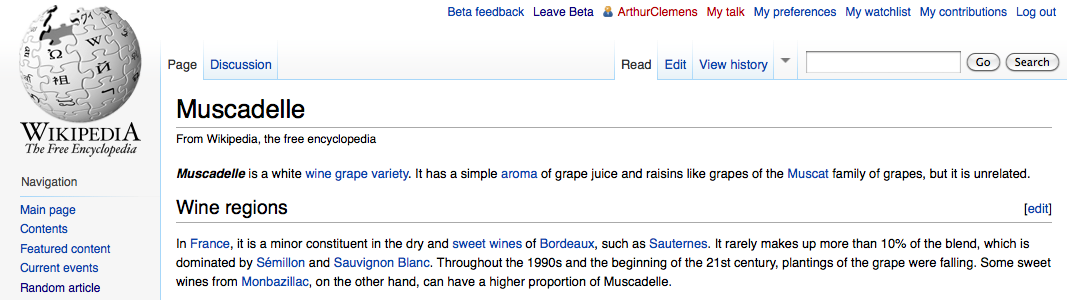
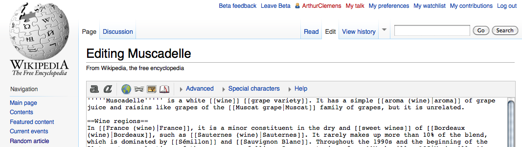
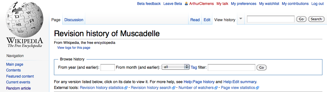 -- ArthurClemens - 04 Nov 2009
I have created a design mockup with an inpage menu:
The original idea, with arrows indicating dropdowns (but that increase feeling of clutter). The menu is dimmed to 'integrate' into the page:
-- ArthurClemens - 04 Nov 2009
I have created a design mockup with an inpage menu:
The original idea, with arrows indicating dropdowns (but that increase feeling of clutter). The menu is dimmed to 'integrate' into the page: - We take the foswiki site skin because this is the most difficult to get a balanced interface: the main navigation is in the way. -- ArthurClemens - 05 Nov 2009
- 1-click are the button labels that lead you to "view", "edit". The expanded menus show the 2-click actions. -- ArthurClemens - 05 Nov 2009
click to enlarge
click to enlarge

click to enlarge
click to enlarge
click to enlarge
click to enlarge
click to enlarge
- Couple of small links on the page: Edit, Files, Versions, New
- Edit leads to an new screen: an edit area with tabs, more or less consistent with the ideas above
- I like the word "Organize" for setting the parent
- Two Icons Side by Side
- First Icon is View/Read Only has text 'Nav Bar'
- Second Icon is basically a dropdown list containing
- Show
- No Show
- Dynamic
Edit interaction
See InteractionPatternsForEdit -- ArthurClemens - 23 Feb 2010UserExperienceProjectForm edit
| TopicTitle | RethinkingTopicInteraction |
| TopicSummary | Rethinking topic interaction: the way topic interaction is organized just raises the bar for new users, and does not help in getting them to intermediate users |
| Subject | core interface |
| Status | abandoned |
| Status note | no activity |
| Driver | |
| Skills needed | analysis, interaction design, visual design |
| InterestedParties |


| I | Attachment | Action | Size | Date | Who | Comment |
|---|---|---|---|---|---|---|
| |
20091104_menu_with_arrows.png | manage | 63 K | 04 Nov 2009 - 22:30 | ArthurClemens | |
| |
20091104_menu_without_arrows.png | manage | 63 K | 04 Nov 2009 - 22:30 | ArthurClemens | |
| |
20091104_menu_without_arrows_-_pane.png | manage | 66 K | 04 Nov 2009 - 22:30 | ArthurClemens | |
| |
Adobe_Acrobat.png | manage | 42 K | 30 Apr 2009 - 20:11 | ArthurClemens | Application menu of Adobe Acrobat (not the textual menu at the top of the screen) |
| |
GMail.png | manage | 23 K | 09 May 2009 - 20:43 | ArthurClemens | Button menu in <nop>GMail |
| |
New_topic_interaction1.png | manage | 63 K | 08 Oct 2009 - 22:16 | ArthurClemens | |
| |
New_topic_interaction2.png | manage | 46 K | 09 Oct 2009 - 13:17 | ArthurClemens | |
| |
New_topic_interaction3.png | manage | 57 K | 08 Oct 2009 - 22:18 | ArthurClemens | |
| |
New_topic_interaction4.png | manage | 31 K | 09 Oct 2009 - 11:34 | ArthurClemens | |
| |
New_topic_interaction5.png | manage | 34 K | 08 Oct 2009 - 22:18 | ArthurClemens | |
| |
New_topic_interaction6.png | manage | 40 K | 09 Oct 2009 - 11:34 | ArthurClemens | |
| |
New_topic_interaction7.png | manage | 40 K | 09 Oct 2009 - 13:17 | ArthurClemens | |
| |
New_topic_interaction_2-1.png | manage | 55 K | 11 Oct 2009 - 15:22 | ArthurClemens | |
| |
New_topic_interaction_2-2.png | manage | 96 K | 11 Oct 2009 - 15:22 | ArthurClemens | |
| |
New_topic_interaction_2-3.png | manage | 38 K | 11 Oct 2009 - 15:23 | ArthurClemens | |
| |
New_topic_interaction_2-4.png | manage | 35 K | 11 Oct 2009 - 15:23 | ArthurClemens | |
| |
New_topic_interaction_2-5.png | manage | 112 K | 11 Oct 2009 - 15:23 | ArthurClemens | |
| |
RTI_default_00.png | manage | 47 K | 05 Oct 2009 - 10:01 | CarloSchulz | An desktop application oriented user interface - default |
| |
RTI_default_01_topic.png | manage | 79 K | 05 Oct 2009 - 10:34 | CarloSchulz | |
| |
RTI_default_02_history.png | manage | 85 K | 05 Oct 2009 - 10:36 | CarloSchulz | |
| |
RTI_default_02_history_sub.png | manage | 94 K | 05 Oct 2009 - 10:36 | CarloSchulz | |
| |
RTI_default_03_location.png | manage | 85 K | 05 Oct 2009 - 10:36 | CarloSchulz | |
| |
RTI_default_04_foswikitools.png | manage | 117 K | 05 Oct 2009 - 10:37 | CarloSchulz | |
| |
RTI_default_05_help.png | manage | 106 K | 05 Oct 2009 - 10:37 | CarloSchulz | |
| |
RTI_extended_00.png | manage | 50 K | 05 Oct 2009 - 10:27 | CarloSchulz | |
| |
RTI_extended_01_export.png | manage | 92 K | 05 Oct 2009 - 10:44 | CarloSchulz | |
| |
RTI_extended_02_admin.png | manage | 124 K | 05 Oct 2009 - 10:44 | CarloSchulz | |
| |
buttons.png | manage | 96 K | 29 Sep 2009 - 19:30 | ArthurClemens | |
| |
edit_with_viewport.png | manage | 121 K | 05 Nov 2009 - 21:45 | CarloSchulz | |
| |
perpetual-intermediates.png | manage | 189 K | 21 Apr 2009 - 20:09 | WillNorris | |
| |
top_bar.png | manage | 104 K | 05 Nov 2009 - 22:53 | ArthurClemens | topic actions at top on a pattern skin page |
| |
top_bar_no_arrows.png | manage | 104 K | 05 Nov 2009 - 22:53 | ArthurClemens | topic actions at top on a pattern skin page - without arrows |
| |
top_bar_no_arrows_facebook_colors.png | manage | 105 K | 05 Nov 2009 - 22:53 | ArthurClemens | topic actions at top on a pattern skin page - with Facebook colors |
| |
top_bar_no_arrows_light_bg.png | manage | 104 K | 05 Nov 2009 - 22:53 | ArthurClemens | topic actions at top on a pattern skin page - on a light background |
| |
view_with_viewport.png | manage | 102 K | 05 Nov 2009 - 21:44 | CarloSchulz | |
| |
view_with_viewport_menu.png | manage | 112 K | 05 Nov 2009 - 21:51 | CarloSchulz | |
| |
wikipedia_new_edit.png | manage | 114 K | 04 Nov 2009 - 20:04 | ArthurClemens | |
| |
wikipedia_new_history.png | manage | 95 K | 04 Nov 2009 - 20:05 | ArthurClemens | |
| |
wikipedia_new_view.png | manage | 102 K | 04 Nov 2009 - 20:02 | ArthurClemens |
Edit | Attach | Print version | History: r82 < r81 < r80 < r79 | Backlinks | View wiki text | Edit wiki text | More topic actions
Topic revision: r82 - 12 Mar 2014, MichaelDaum
The copyright of the content on this website is held by the contributing authors, except where stated elsewhere. See Copyright Statement.  Legal Imprint Privacy Policy
Legal Imprint Privacy Policy