|
|
You are here: Foswiki>Development Web>UserExperienceHub>UserExperienceTaskTeamProjects>UserExperienceProjectWebsiteDesign>HomepageRedesignTalks (30 Jul 2010, ArthurClemens)Edit Attach
Homepage redesign - discussion page
- CarloSchulzSandbox by Carlo
- HomeTest by Arthur
Carlo's proposal
- superseded by Arthur's latest re-design improveents. We have just one proposal now, which integrates ideas from both.
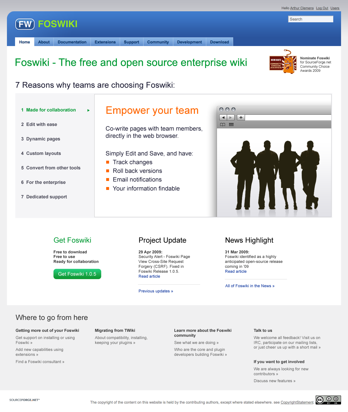
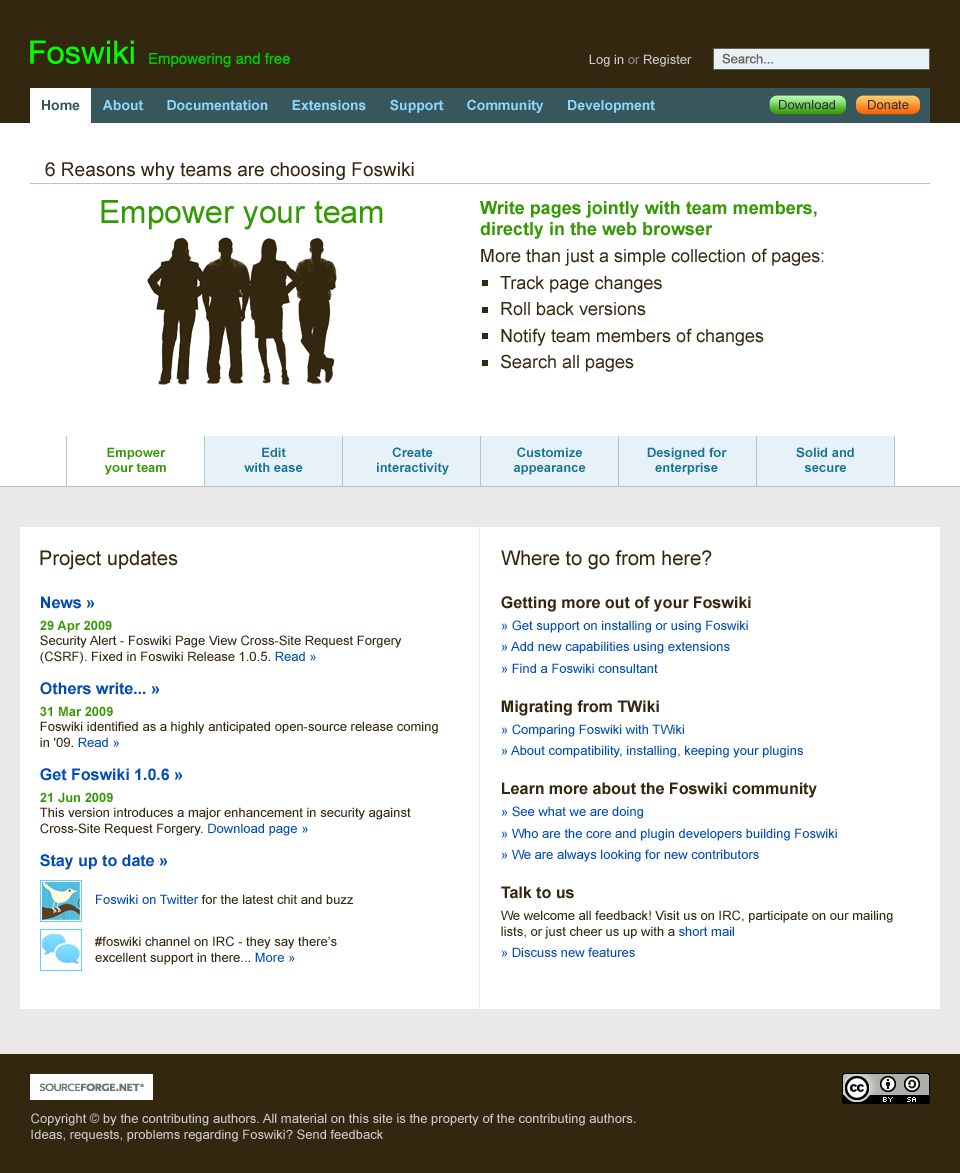
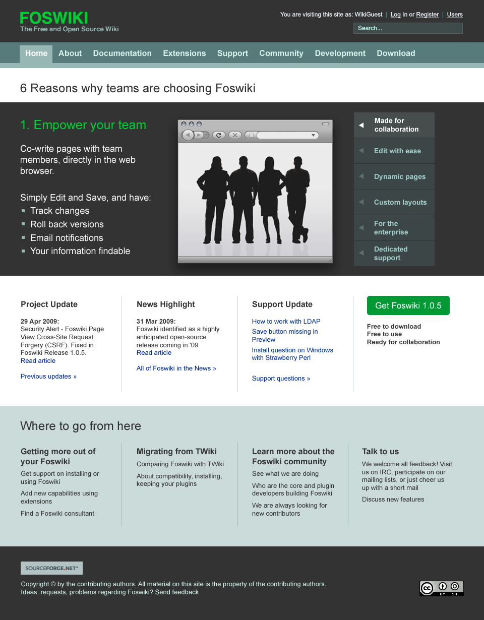
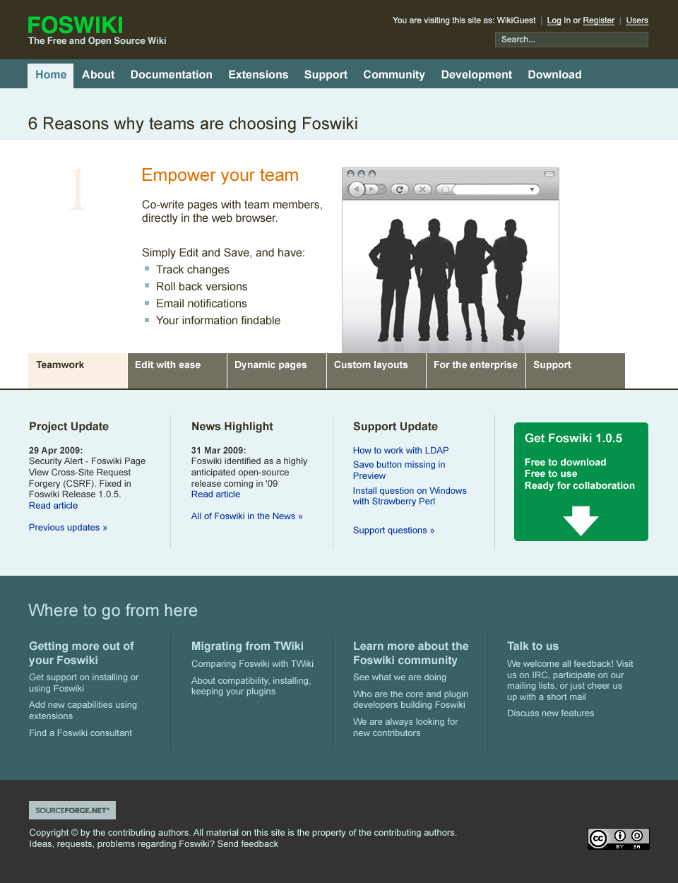
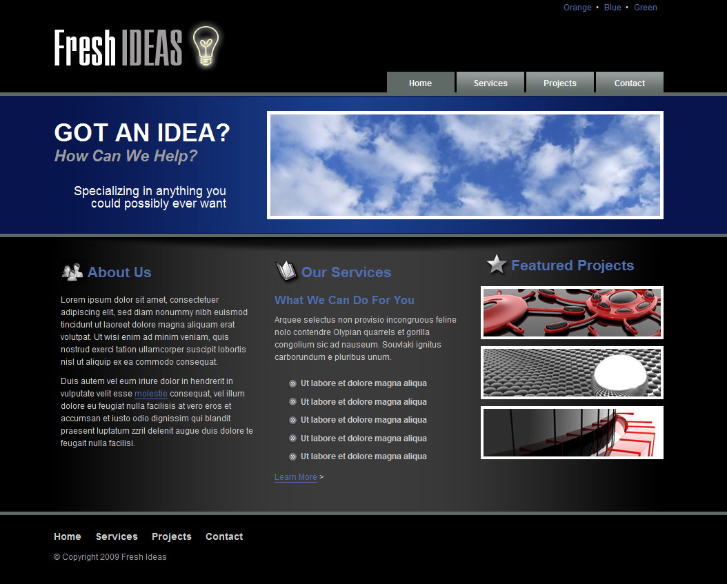
Arthur's proposal
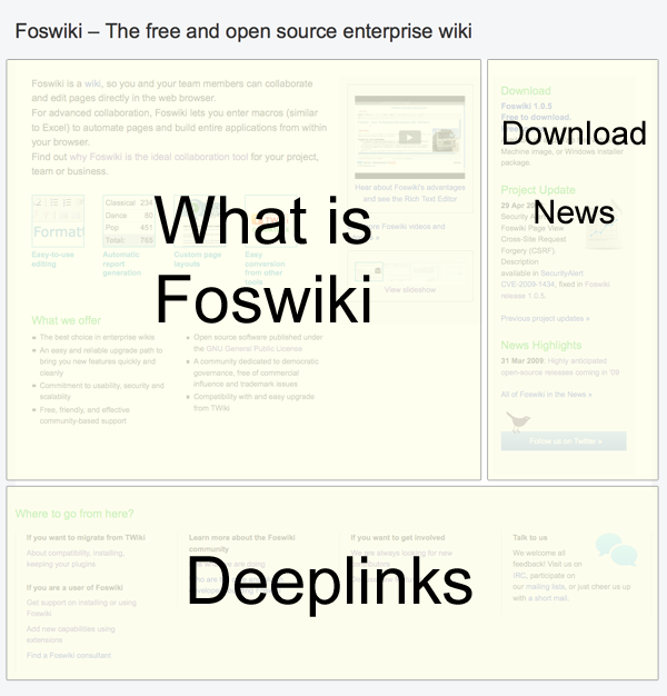
click to enlarge
- Introduction to Foswiki
- Download, news, updates
- Entry points to deeper pages
- Considering that new visitors need a proper introduction to Foswiki, I have reserved a very large part of the homepage to that. We cannot assume people know anything.
- I find it important to show how Foswiki looks like, at least to start from here: video's and slideshows. Making it visible is making it understandable.
- I have added Carlo's proposal for "What others are saying"
- Like Carlo I have put emphasis on the download banner
- It is important that the homepage shows updates.
- I find Project Update very good, but I have trimmed the items to show.
- Foswiki in the news - the news volume is rather slim these days. I found it a waste to link to short blog posts. I don't like the table layout of the current homepage.
- What to do next? That is an important question. Here we have different target groups, easy to recognize. This can be visually more dressed, like icons for Community or Involved.
Combining the proposals
Topics to agree upon:- Which target groups
- Goals of the homepage
- Supported user flows
- Visual design
- (at the very end) Technical implementation.
- Yahoo Grids is a more advanced solution than a table. both proposals now use Yahoo Grids
- Externally link the CSS for validation
Discussion
Here's a bit of food for thought from http://themeforest.net. There's much more nice stuff on that site. I uploaded just a few that most most probably don't match Foswiki.org as a product&community site. I still feel inclined to say that the proposals so far lack state-of-the-art webdesign. You probably know that already, still I want to raise the barrier by putting up contrasting examples and to sharpen perception a bit. Have a look at themeforest or other (template) sites. Take your screenshot gun out and add inspiration. I am very sorry for asking to go back to inspiration mode, but that's basically what is needed to get the homepage decent. -- MichaelDaum - 12 May 2009I am very sorry for asking to go back to inspiration mode, but that's basically what is needed to get the homepage decent. I don't agree that it has to do with concept or inspiration. It is mainly a matter of design execution. That need to be improved. -- ArthurClemens - 12 May 2009 True. Don't misunderstand it. I don't meant this offensive. As I said on the ML already, the proposed frontpages clash with the design of the rest of the page. The concept probably needs to cover all of the page - not only the content area. The proposed layouts at NewNavigationModelForTWikiDotOrg where better already. -- MichaelDaum - 12 May 2009 Also true. But this will take another epoch before that is created/agreed/etc. We also need a shortterm solution to provide better info and entry points. -- ArthurClemens - 12 May 2009 Sorry, no time so far to comment on my proposal. "...get the homepage decent." However, what we have now as a homepage is not even discussable. So from that point of view both proposal offfer a significant improvement. They are, of course, not state of the art. But instead of leaving our homepage as it is until we have a cool "state of the art" front page (which could easily last weeks or even months), we should go ahead with one of the two proposals and improve them step by step... -- CarloSchulz - 13 May 2009 En example of good design + good entry points + real content is Miro. Take away: everything is made visually simple, bite sized texts, visual entry points. Video directly on the page. -- ArthurClemens - 13 May 2009 On a second look, I have to say above design templates may look more professional but they are also quiet boring. -- CarloSchulz - 13 May 2009 These are templates from the "corporate design" category of http://themeforest.net. That's obviously no direct fit for foswiki.org. I just provided them so that people can contrast them with foswiki... I like Miro - looks sheep
 -- MichaelDaum - 13 May 2009
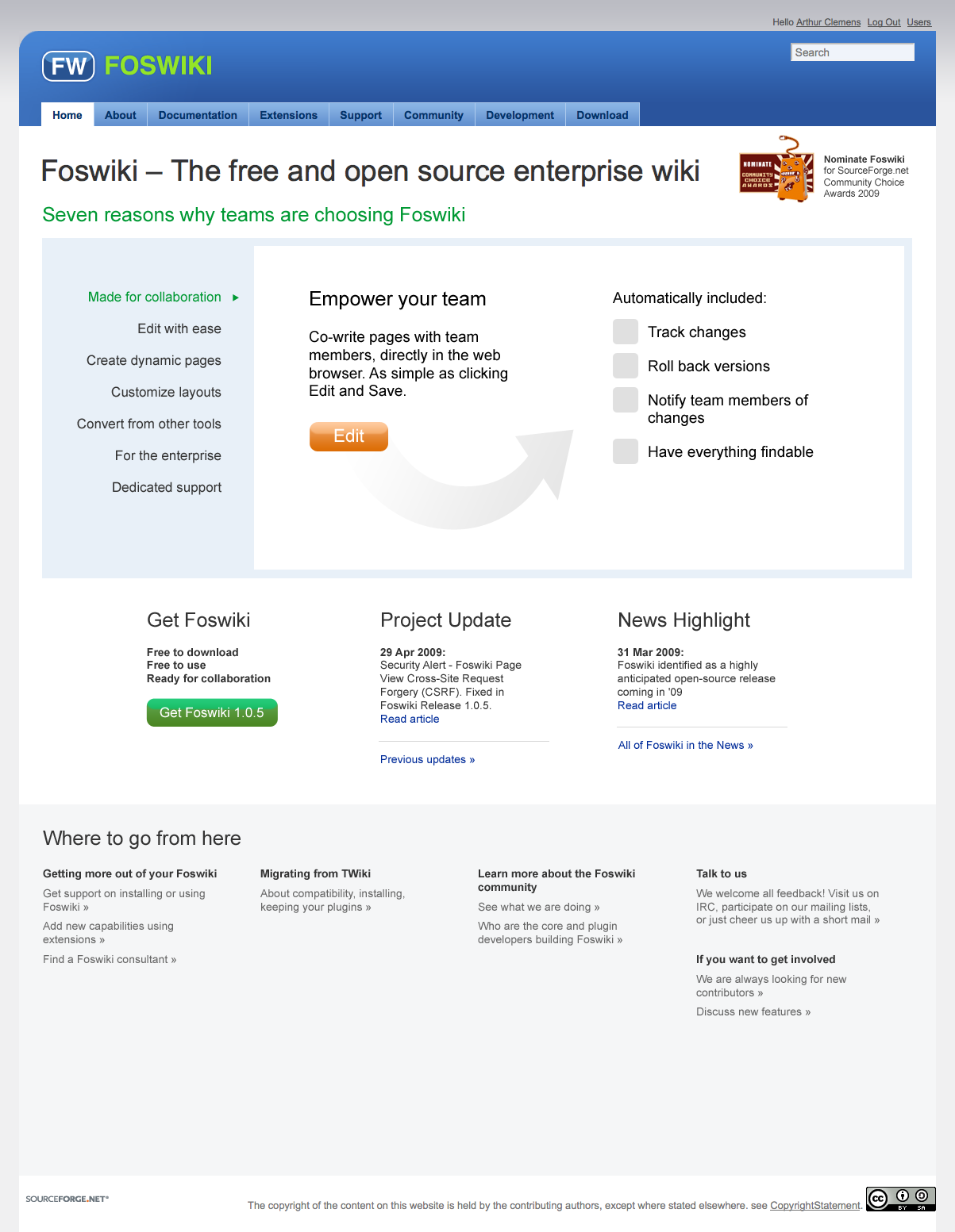
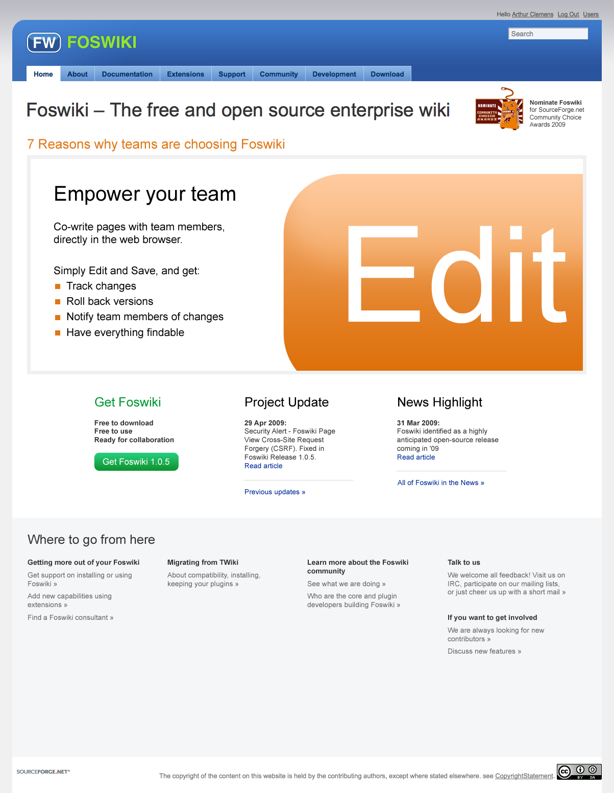
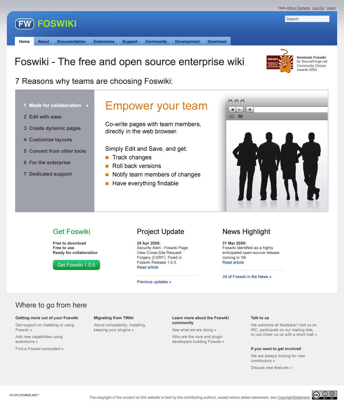
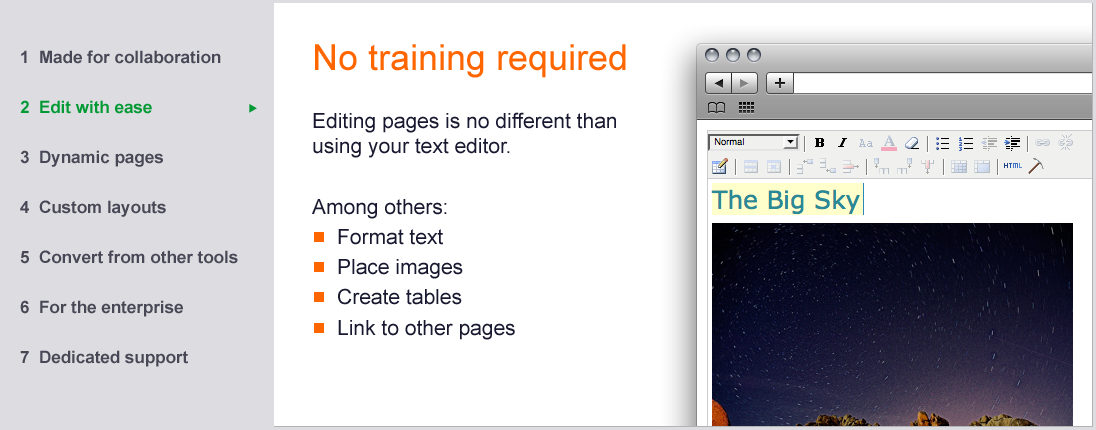
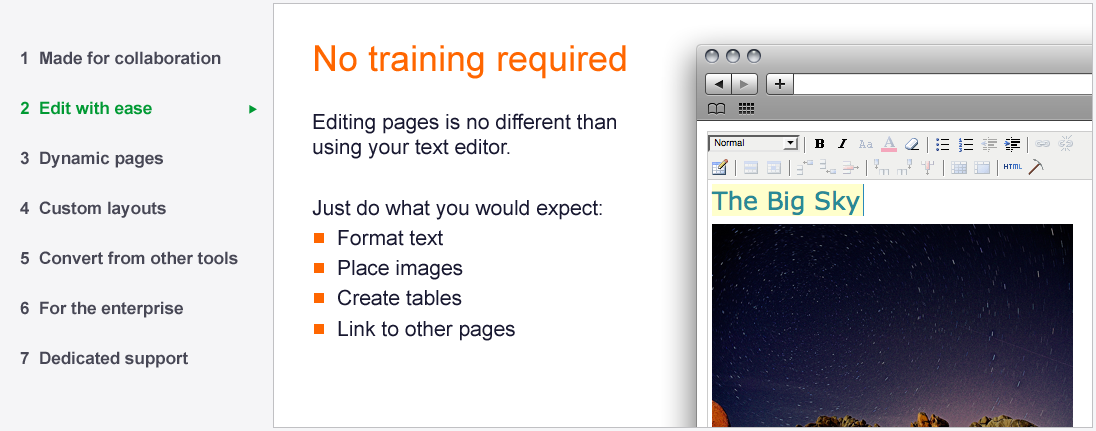
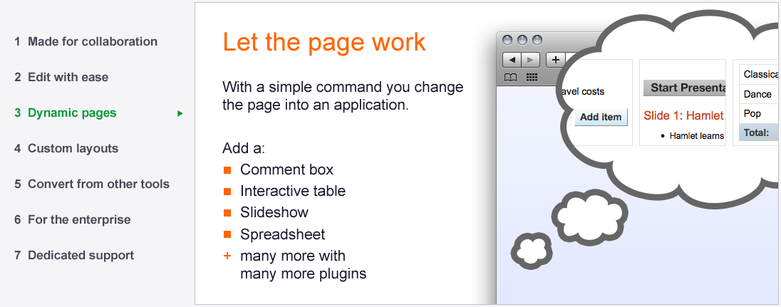
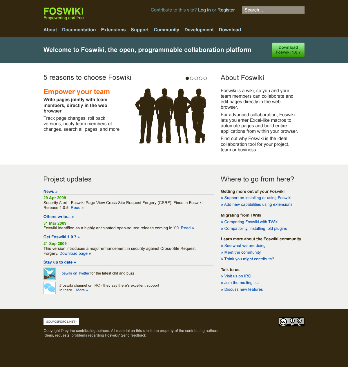
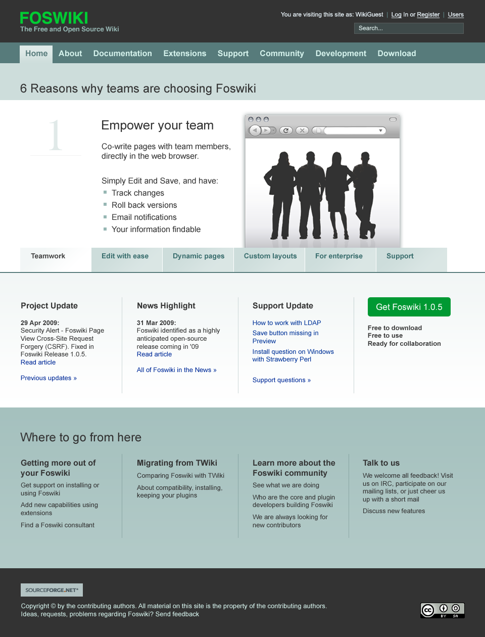
I have started sketching again in Photoshop. I am trying to make the benefits more bitesized, more visual. The left works as a menu. The right side should include screenshots as well, where appropriate.
-- MichaelDaum - 13 May 2009
I have started sketching again in Photoshop. I am trying to make the benefits more bitesized, more visual. The left works as a menu. The right side should include screenshots as well, where appropriate.
click to enlarge
click to enlarge
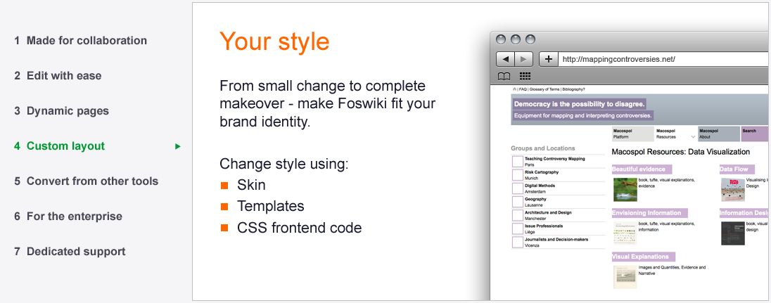
- Communicate the name, so "Foswiki" needs to be in the content
- Communicate the tagline, because this is what the project is about. This can be on the same line or just below the title.
- Foswiki is simple to use, with a lot of power under the hood
- We don't have to explain "Wiki", just what you get from it (that is the first 'slide'): it improves collaboration ("empowers your team")
- No need to learn wiki language, because we have a very good Word-like editor
- Powerful, but (relatively) easy: dynamic pages (we won't use 'programmable' because that sounds like something lots of people cannot do)
- You can change the layout to fit your house style / integrate with your other sites
- Easy to convert: in any case from TWiki. Here we need other examples too, from MediaWiki and Confluence, etc.
- For the enterprise: LDAP support, access management (other things?)
- Support: an active and helpful community
click to enlarge
click to enlarge
click to enlarge
-- CarloSchulz - 22 May 2009
I think the problem is the "Among others". That should be more playful, for instance "Just do what you would expect".
Two more screens:
click to enlarge
click to enlarge
click to enlarge
 any chance we just make the topics now?
If you're mostly worried about text, thats something the wiki-hive-mind can work on together-like
(I like what I see)
-- SvenDowideit - 23 May 2009
You are right. The base is there. I am now buiding the CSS + JS for it.
-- ArthurClemens - 23 May 2009
I'm really excited by this; the screenshots look great!
-- CrawfordCurrie - 24 May 2009
I find the 7 reasons slideshow a quite massive and not very helpful in the long run, i.e. how to learn more about concept xyz. While it addresses newcomers' needs, most other types of visitors will have to scroll down and try to find something else to chew on.
any chance we just make the topics now?
If you're mostly worried about text, thats something the wiki-hive-mind can work on together-like
(I like what I see)
-- SvenDowideit - 23 May 2009
You are right. The base is there. I am now buiding the CSS + JS for it.
-- ArthurClemens - 23 May 2009
I'm really excited by this; the screenshots look great!
-- CrawfordCurrie - 24 May 2009
I find the 7 reasons slideshow a quite massive and not very helpful in the long run, i.e. how to learn more about concept xyz. While it addresses newcomers' needs, most other types of visitors will have to scroll down and try to find something else to chew on.
- I think it would be helpful to add "learn more" links to sections. -- ArthurClemens - 24 May 2009
- Previous attempts tried to do too much on the homepage, without explaining the product Foswiki first. That means that some other info is pushed down or away. The position of the "vote" trigger can also be used for other news that needs attention: a new release, a security alert, etc. -- ArthurClemens - 24 May 2009
- The layout of the block needs to be improved. Once you see it is a menu, it becomes obvious that the items are links. -- ArthurClemens - 24 May 2009
- As you have suggested before, we can use an alternative layout for the homepage. But I rather finish this thing first. -- ArthurClemens - 24 May 2009
- The 'menu' items will not align, otherwise the body will get lower and lower. -- ArthurClemens - 24 May 2009
- I have added a bg to the highlighted menu (code, no screenshot yet). -- ArthurClemens - 24 May 2009
- Sure, its fine. You are making suggestions for improvements. -- ArthurClemens - 24 May 2009
click to enlarge
- Yes, please show us your ideas! -- ArthurClemens - 02 Jun 2009
- What have you got so far for each of the 6 points? -- MichaelDaum - 04 Jun 2009
- I have four so far: see the small browser screens above. "For the enterprise" and "Support" still to go. -- ArthurClemens - 04 Jun 2009
 -- FranzJosefGigler - 02 Jun 2009
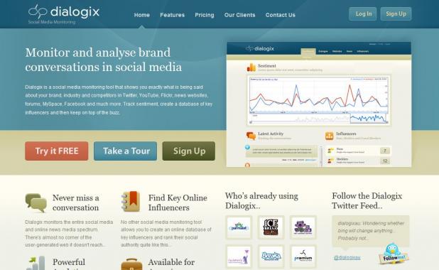
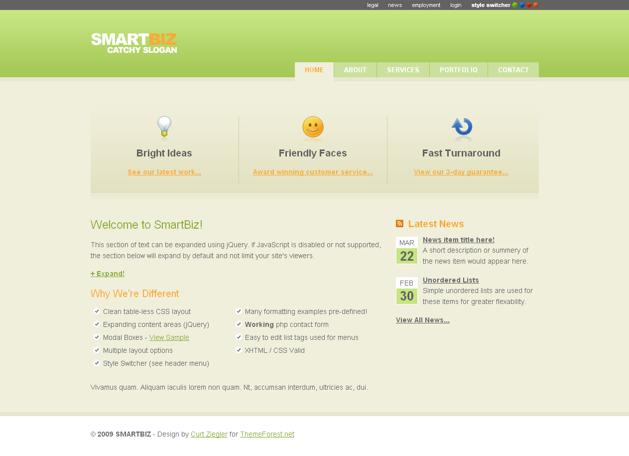
Here's a similar from http://www.dialogix.com.au/:
-- FranzJosefGigler - 02 Jun 2009
Here's a similar from http://www.dialogix.com.au/:
click to enlarge
click to enlarge
-- OliverKrueger - 03 Jul 2009
Another inspiring example. As you see we don't do something absolutely new.
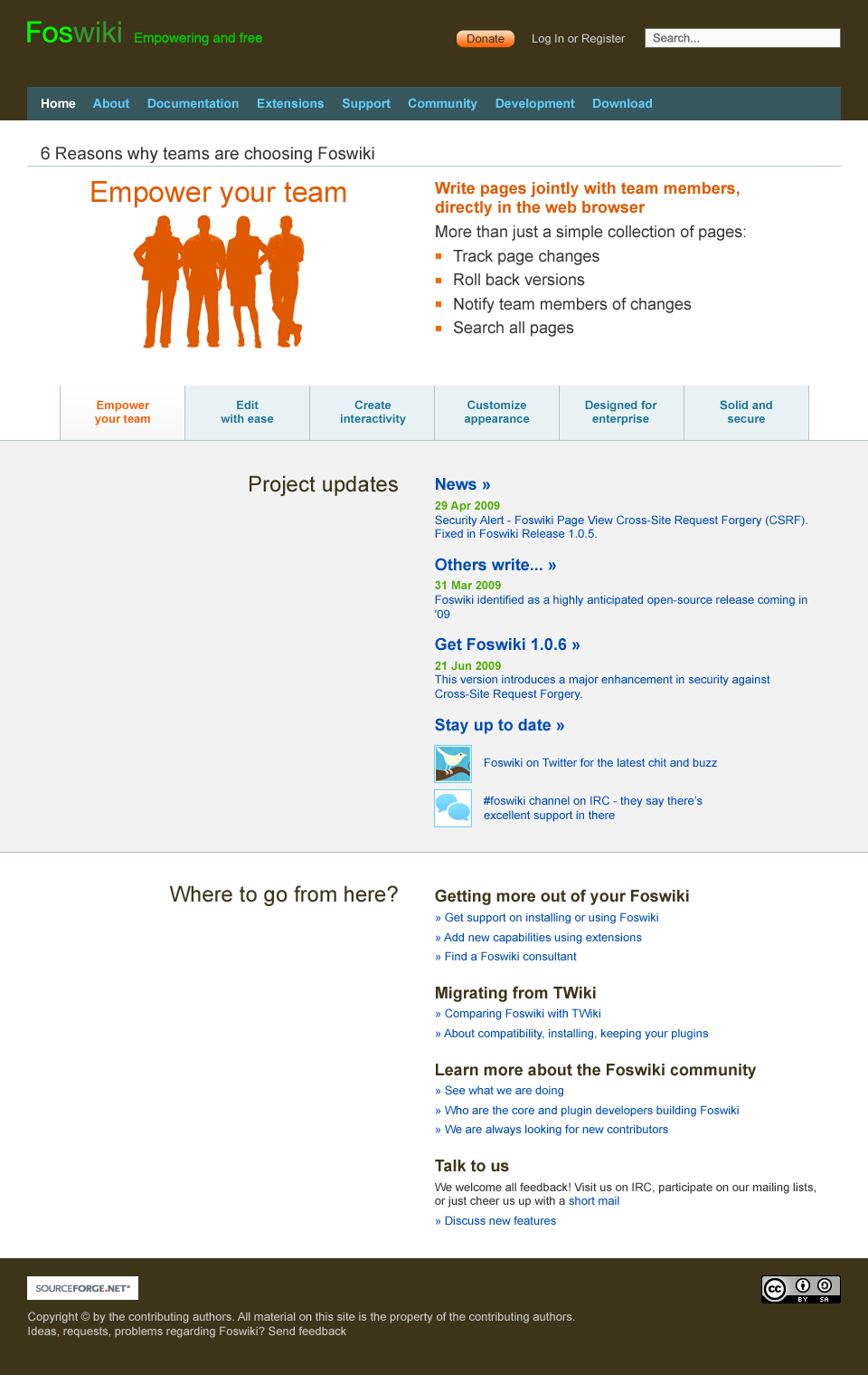
click to enlarge
-- MichaelDaum - 03 Jul 2009
I still do prefer the colors of Foswiki_homepage10-collaboration.png. Foswiki already got linked with the logo and blue headline in my mind.
-- JanDreyer - 06 Jul 2009
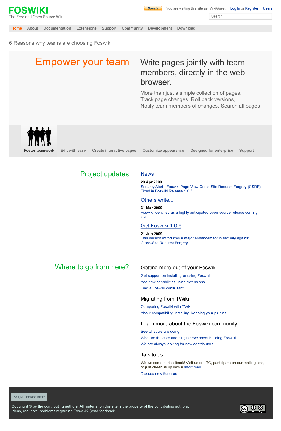
I have used the layout of 05 with the colors of 02k:
click to enlarge
- I like the overall design of the top bar containing the logo and the horiz navi.
- The top bar content might need a bit more of a vertical balancing of the white space, i.e. above the logo.
- The two greens for Fos and wiki are a nice idea but too much I am afraid.
- The orange used in the 6 reasons does not work out. It gives a kind of negative colors effect which is a bit stressful for the eyes.
- I have the impression that the concept for the two sections "Project Updates" and "Where to go from here" don't provide a stable base for the building blocks above at the page. The idea might work out pretty well on another design that has not got a heavy weight top section on the page. This design however seems to need to be more solid down there IMHO.
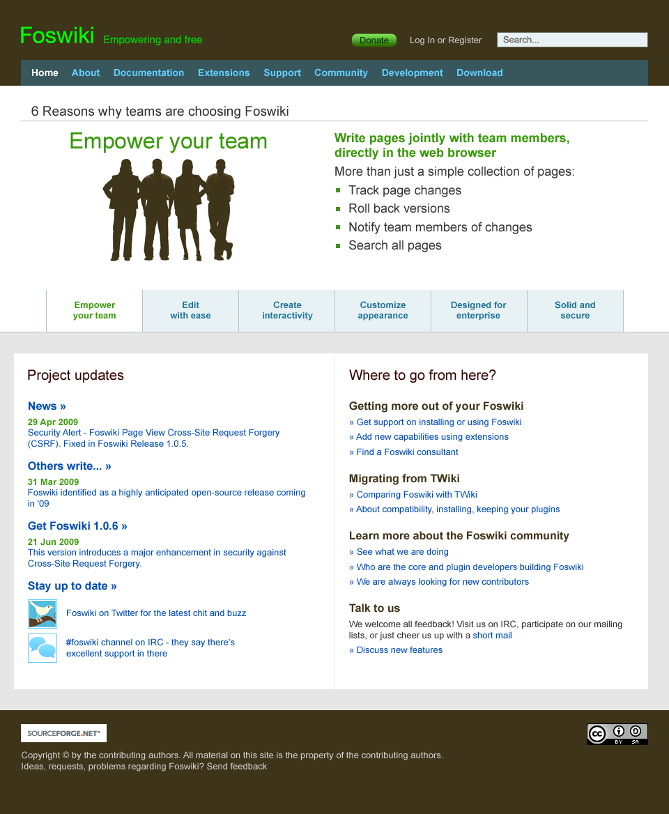
click to enlarge
I recognized that this idea different comparing to some people i talked to before, so maybe its just me missing such a point. -- EugenMayer - 12 Jul 2009 Thanks Eugen. I have put more emphasis on the download link.
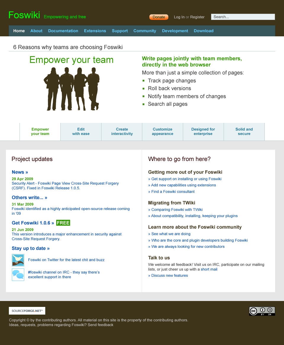
click to enlarge
click to enlarge
It takes so long because it takes so long. So be it. I'd prefer to see this in a very positive light instead because the result will be much nicer.
-- MichaelDaum - 13 Jul 2009
Please do not get me wrong, this is not meant as downtalking at all. I really appreciate the outcome of this process so far and I agree that it was worth waiting for.
I'm as well one of those who aim for the best possible solution instead of releasing something halfbaked. However, halfbaked is still better than quarterbaked and I do not believe that an interim solution would have prevented this design outcome.
So this is more a thinking about "agile" vs. "waterfall" development of design and whether our current waterfall approach towards design issues is the way to go.
-- CarloSchulz - 13 Jul 2009
all I can doo is cheer you guys along - as an ugly developer, i'd be more than thrilled with what is there atm. I would love to hear a story about where the choices come from - but thats just idle curiosity
-- SvenDowideit - 13 Jul 2009
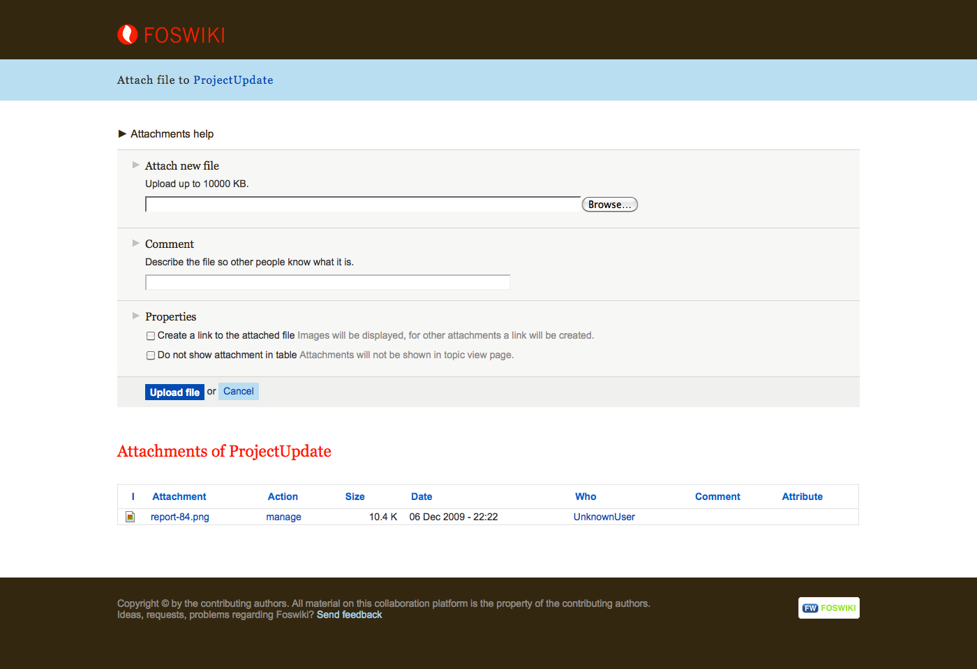
Small addition to the latest draft: we should have a search button, not just the inline text saying "search" - You are right. -- ArthurClemens - 14 Jul 2009
- Caution, there are two unrelated buttons nearby already -- MichaelDaum - 14 Jul 2009
click to enlarge
- Create skin
- Update foswiki.org around Foswiki release 1.1
Draft descriptions of Foswiki
Draft text for the descriptions of Foswiki is located on HomepageRedesignDraftText.Status update
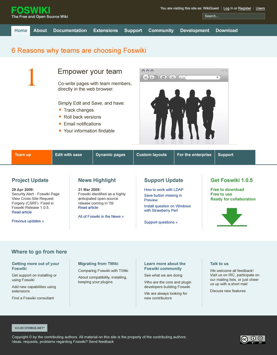
I want to bring you up to date with the work in progress on the current homepage and the new site skin. This is no longer Photoshop, these are working pages! The homepage now features a content slider that resizes with the window resize. So on a smaller screen you should still see all content.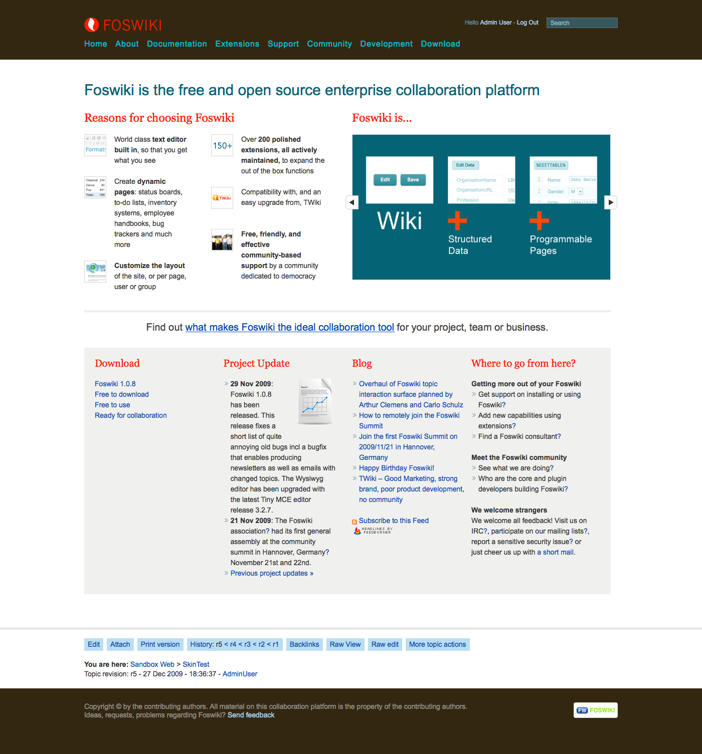
click to enlarge
click to enlarge
click to enlarge


| I | Attachment | Action | Size | Date | Who | Comment |
|---|---|---|---|---|---|---|
| |
01_colors_green.jpg | manage | 240 K | 12 May 2009 - 07:39 | MichaelDaum | |
| |
02e.png | manage | 176 K | 31 May 2009 - 12:56 | ArthurClemens | Homepage redesign around benefits block |
| |
02i.png | manage | 180 K | 31 May 2009 - 22:46 | ArthurClemens | |
| |
02j.png | manage | 172 K | 01 Jun 2009 - 21:55 | ArthurClemens | |
| |
02k.png | manage | 166 K | 02 Jun 2009 - 11:22 | ArthurClemens | |
| |
05.png | manage | 130 K | 27 Jun 2009 - 20:09 | ArthurClemens | |
| |
06c.png | manage | 156 K | 11 Jul 2009 - 10:42 | ArthurClemens | |
| |
07.png | manage | 150 K | 12 Jul 2009 - 12:03 | ArthurClemens | |
| |
07b.png | manage | 151 K | 12 Jul 2009 - 15:33 | ArthurClemens | |
| |
07c.png | manage | 151 K | 12 Jul 2009 - 19:00 | ArthurClemens | |
| |
07d.png | manage | 161 K | 12 Jul 2009 - 20:46 | ArthurClemens | |
| |
07g.png | manage | 190 K | 20 Sep 2009 - 13:03 | ArthurClemens | |
| |
1_Homepage-green.jpg | manage | 175 K | 12 May 2009 - 07:39 | MichaelDaum | |
| |
1_homepage.jpg | manage | 154 K | 12 May 2009 - 07:40 | MichaelDaum | |
| |
1_screenBlue.jpg | manage | 244 K | 12 May 2009 - 07:39 | MichaelDaum | |
| |
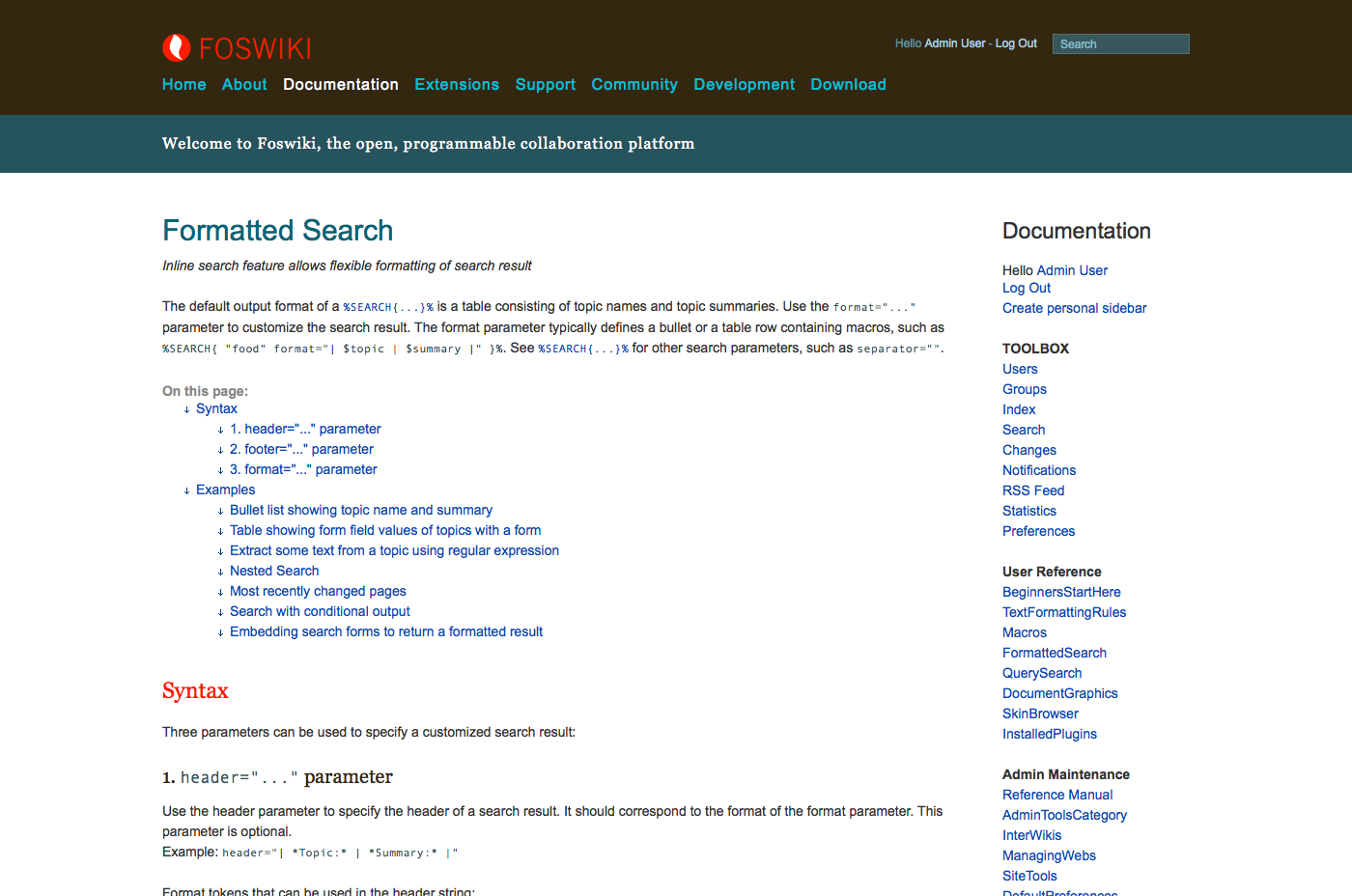
20091227_FormattedSearch.png | manage | 144 K | 27 Dec 2009 - 21:14 | ArthurClemens | |
| |
20091227_attach.png | manage | 80 K | 27 Dec 2009 - 21:14 | ArthurClemens | |
| |
20091227_homepage.png | manage | 289 K | 27 Dec 2009 - 21:13 | ArthurClemens | |
| |
2_Homepage.jpg | manage | 333 K | 12 May 2009 - 07:41 | MichaelDaum | |
| |
Foswiki_homepage10-collaboration.png | manage | 206 K | 22 May 2009 - 20:29 | ArthurClemens | |
| |
Foswiki_homepage10-dynamic.png | manage | 72 K | 22 May 2009 - 20:36 | ArthurClemens | |
| |
Foswiki_homepage10-edit.png | manage | 178 K | 21 May 2009 - 21:53 | ArthurClemens | |
| |
Foswiki_homepage10-edit2.png | manage | 180 K | 22 May 2009 - 20:29 | ArthurClemens | |
| |
Foswiki_homepage10-layout.png | manage | 101 K | 22 May 2009 - 21:58 | ArthurClemens | |
| |
Foswiki_homepage6.png | manage | 173 K | 17 May 2009 - 19:36 | ArthurClemens | |
| |
Foswiki_homepage8.png | manage | 171 K | 20 May 2009 - 07:13 | ArthurClemens | Large visual |
| |
Foswiki_homepage9.png | manage | 205 K | 20 May 2009 - 23:57 | ArthurClemens | |
| |
Homepage_patch_plan.png | manage | 142 K | 13 May 2009 - 08:56 | ArthurClemens | |
| |
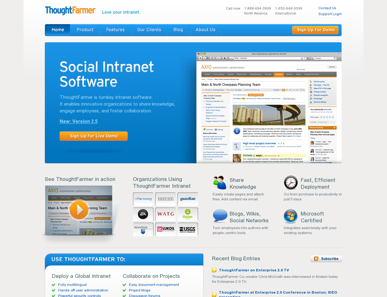
ThoughtFarmerSnap1.png | manage | 361 K | 03 Jul 2009 - 20:58 | MichaelDaum | another example |
| |
dialogix.jpg | manage | 34 K | 04 Jun 2009 - 13:49 | MichaelDaum | http://www.dialogix.com.au/ |
Edit | Attach | Print version | History: r81 < r80 < r79 < r78 | Backlinks | View wiki text | Edit wiki text | More topic actions
Topic revision: r81 - 30 Jul 2010, ArthurClemens
The copyright of the content on this website is held by the contributing authors, except where stated elsewhere. See Copyright Statement.  Legal Imprint Privacy Policy
Legal Imprint Privacy Policy