|
|
You are here: Foswiki>Community Web>TaskTeam>MarketingTaskTeam>MarketingHub>BrandLogo>BrandLogoTalk (19 Mar 2014, MichaelDaum)Edit Attach
Brand Logo talk page
Previous discussion: revision 125 A while ago the Foswiki Association Board has asked me to (continue to) work on the logo. I would like to present you now the latest iterations. With your votes I will finish the winning version (and use your feedback to make refinements). Hopefully we can finish this process soon (and before my holidays). So I would like to set the deadline on Saturday 23 June, 2012.Brand
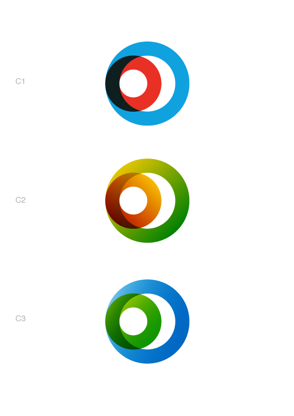
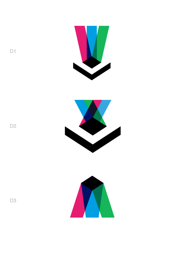
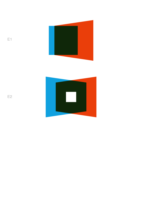
Foswiki is an open source project, a community effort, a product used in professional environments, a tool with great flexibility and potential, used by various kinds of users. People rely on it to manage their knowledge assets for a long time, to coordinate and exchange information etc, listing the activities users do on a wiki site. Keywords: activity, collaboration, getting active, grouping up, projects, knowledge, sharing information. For the logo design I have focussed on:- open (in the sense of open to people, inviting)
- group/community (working together, or individual within a larger entity; enclosing but not closed)
- extending outwards (as a community, or information)
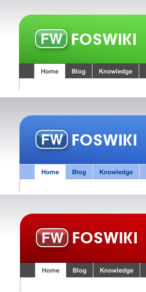
Logo versions
These versions are still without logo type. You'll have to imagine the Foswiki name next to it.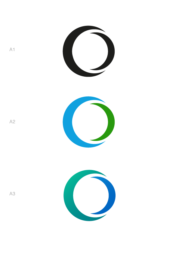
click to enlarge

click to enlarge
click to enlarge
click to enlarge
click to enlarge
Comments
to see them as (poorly converted and not tweaked) favicons, click on the html files or see them all in one page in small -- SvenDowideit - 03 Jun 2012Votes
-- ArthurClemens - 02 Jun 2012- kip-foswiki-logo.png:

- kip2-foswiki-logo.png:

- it must not be too similar to the Wikiring logo (check the colors, while staying away from tmwiki colors)
- it must not be too similar to the Ohloh logo (the new owner Black Duck Software has chosen to bring the Ohloh logo close to their own logo: http://www.blackducksoftware.com/)
- For some added brainstorming idea - circle and wiki works together:

- variant 2:

click to enlarge
BasicForm edit
| TopicClassification | MarketingWork |
| Topic Summary | Foswiki logo development |
| Interested Parties | |
| Related Topics |


| I | Attachment | Action | Size | Date | Who | Comment |
|---|---|---|---|---|---|---|
| |
Foswiki_fun.png | manage | 27 K | 14 Mar 2011 - 07:55 | CrawfordCurrie | A bit of fun |
| |
Foswiki_fun2.png | manage | 7 K | 14 Mar 2011 - 08:25 | CrawfordCurrie | |
| |
Foswiki_logo_2011-ico.png | manage | 851 bytes | 10 Jan 2011 - 13:11 | ArthurClemens | Foswiki logo 2011 favicon |
| |
Foswiki_logo_2011.ico | manage | 318 bytes | 02 Mar 2011 - 09:22 | FranzJosefGigler | favicon? |
| |
Foswiki_logo_2011.png | manage | 43 K | 09 Jan 2011 - 18:33 | ArthurClemens | Foswiki logo 2011 |
| |
Foswiki_logo_font.ai | manage | 1 MB | 11 Jan 2011 - 20:25 | ArthurClemens | |
| |
Foswiki_logo_font.svg | manage | 211 K | 11 Jan 2011 - 20:27 | ArthurClemens | |
| |
Foswiki_logo_horizontal.ai | manage | 1 MB | 11 Jan 2011 - 20:28 | ArthurClemens | |
| |
Foswiki_logo_horizontal.svg | manage | 3 K | 11 Jan 2011 - 20:28 | ArthurClemens | |
| |
Foswiki_logo_horizontal_300dpi.png | manage | 26 K | 11 Jan 2011 - 20:34 | ArthurClemens | |
| |
Foswiki_logo_ico.png | manage | 851 bytes | 11 Jan 2011 - 20:28 | ArthurClemens | |
| |
Foswiki_logo_mark.ai | manage | 1 MB | 11 Jan 2011 - 20:30 | ArthurClemens | |
| |
Foswiki_logo_mark.svg | manage | 1 K | 11 Jan 2011 - 20:30 | ArthurClemens | |
| |
Foswiki_logo_mark_300dpi.png | manage | 23 K | 11 Jan 2011 - 20:29 | ArthurClemens | |
| |
Foswiki_logo_rainbow.png | manage | 9 K | 14 Mar 2011 - 14:37 | CrawfordCurrie | |
| |
Foswiki_logo_rainbow_simple.png | manage | 4 K | 14 Mar 2011 - 14:40 | CrawfordCurrie | |
| |
Foswiki_logo_scaryl.png | manage | 1 K | 14 Mar 2011 - 16:08 | CrawfordCurrie | |
| |
Foswiki_logo_vertical.ai | manage | 1 MB | 11 Jan 2011 - 20:30 | ArthurClemens | |
| |
Foswiki_logo_vertical.svg | manage | 3 K | 11 Jan 2011 - 20:31 | ArthurClemens | |
| |
Foswiki_logo_vertical_300dpi.png | manage | 39 K | 11 Jan 2011 - 20:34 | ArthurClemens | |
| |
WikiLogo.png | manage | 48 K | 16 Jul 2012 - 21:40 | JozefMojzis | For some added brainstorming idea - circle and wiki works together |
| |
WikiLogo2.png | manage | 32 K | 16 Jul 2012 - 21:46 | JozefMojzis | variant 2 |
| |
favicon-f.png | manage | 1 K | 25 Sep 2012 - 23:37 | ArthurClemens | Final logo favicon |
| |
foswiki-logo-arial.svg | manage | 3 K | 21 Jan 2014 - 14:11 | MichaelDaum | |
| |
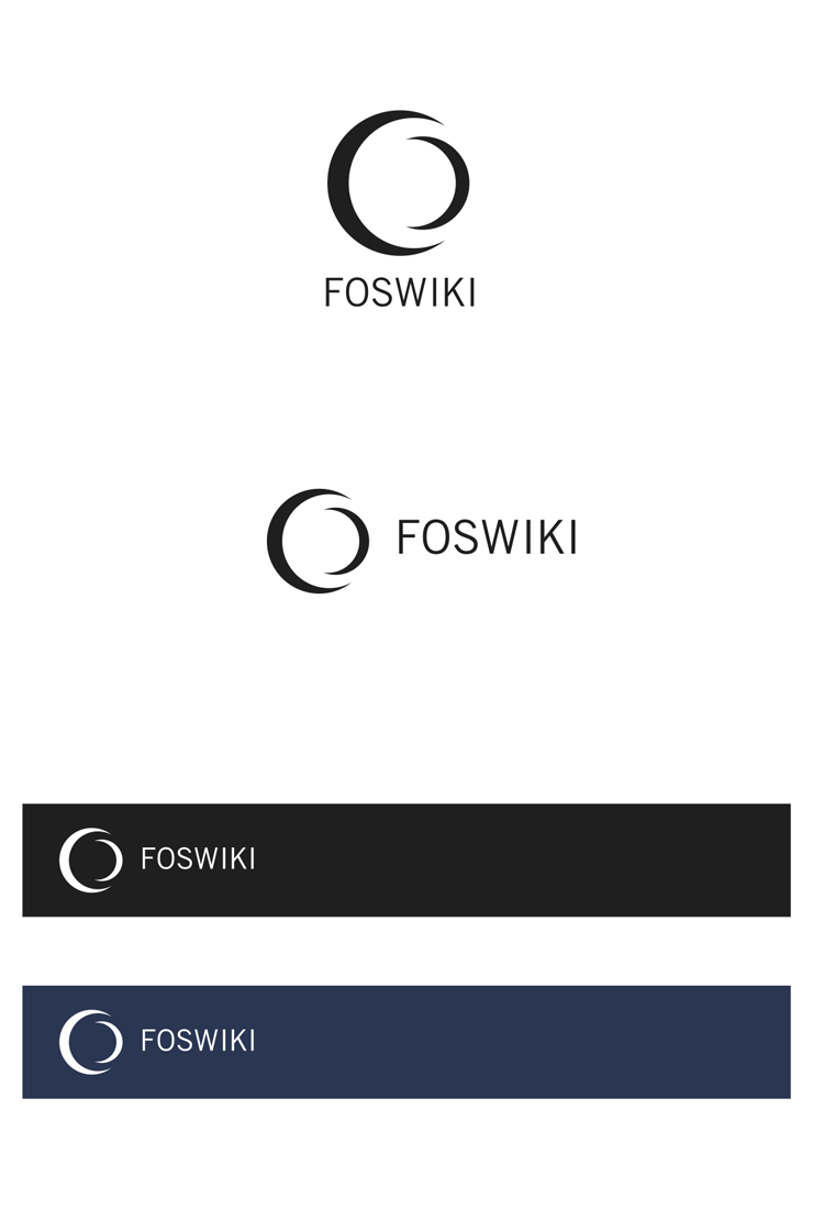
foswiki-logo-final.png | manage | 17 K | 25 Sep 2012 - 23:35 | ArthurClemens | Final logo |
| |
foswiki-logo-final.svg | manage | 4 K | 21 Jan 2014 - 13:48 | AaronFuleki | Final logo in SVG vector format |
| |
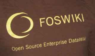
foswiki_logo_shirt.JPG | manage | 19 K | 02 Mar 2011 - 06:02 | SvenDowideit | SvenDowideit in the foswiki LCA2011 tshirt |
| |
fw-logo-colored.png | manage | 49 K | 27 Feb 2011 - 12:18 | MichaelDaum | makeover of current logo with color variations |
| |
kip-foswiki-logo.png | manage | 16 K | 05 Jun 2012 - 00:44 | KipLubliner | |
| |
kip2-foswiki-logo.png | manage | 21 K | 05 Jun 2012 - 01:53 | KipLubliner | |
| |
logo_color_scheme_7.png | manage | 140 K | 13 Mar 2011 - 20:20 | ArthurClemens | |
| |
logo_color_scheme_8.png | manage | 93 K | 13 Mar 2011 - 20:34 | ArthurClemens | |
| |
logo_color_sheme_1.png | manage | 122 K | 06 Mar 2011 - 12:52 | ArthurClemens | |
| |
logo_color_sheme_2.png | manage | 122 K | 06 Mar 2011 - 12:59 | ArthurClemens | |
| |
logo_color_sheme_3.png | manage | 125 K | 06 Mar 2011 - 12:59 | ArthurClemens | |
| |
logo_color_sheme_4.png | manage | 125 K | 06 Mar 2011 - 12:59 | ArthurClemens | |
| |
logo_color_sheme_5.png | manage | 74 K | 06 Mar 2011 - 12:59 | ArthurClemens | |
| |
logo_color_sheme_6.png | manage | 73 K | 06 Mar 2011 - 13:00 | ArthurClemens | |
| |
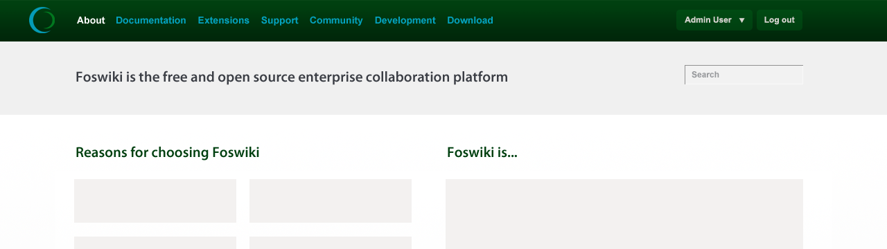
logo_on_page.png | manage | 124 K | 25 Sep 2012 - 23:37 | ArthurClemens | Final logo on a web page |
| |
logos-A.png | manage | 17 K | 02 Jun 2012 - 15:55 | ArthurClemens | |
| |
logos-B.png | manage | 21 K | 02 Jun 2012 - 15:56 | ArthurClemens | |
| |
logos-C.png | manage | 33 K | 02 Jun 2012 - 15:56 | ArthurClemens | |
| |
logos-D.png | manage | 14 K | 02 Jun 2012 - 15:56 | ArthurClemens | |
| |
logos-E.png | manage | 4 K | 02 Jun 2012 - 15:57 | ArthurClemens | |
| |
sven_foswiki_logo.JPG | manage | 19 K | 02 Mar 2011 - 07:04 | SvenDowideit | |
| |
wheel.png | manage | 7 K | 02 Mar 2011 - 09:12 | CrawfordCurrie |
Edit | Attach | Print version | History: r169 < r168 < r167 < r166 | Backlinks | View wiki text | Edit wiki text | More topic actions
Topic revision: r169 - 19 Mar 2014, MichaelDaum
The copyright of the content on this website is held by the contributing authors, except where stated elsewhere. See Copyright Statement.  Legal Imprint Privacy Policy
Legal Imprint Privacy Policy